Bar Graph And Double Bar Graph
Kalali
Mar 23, 2025 · 6 min read
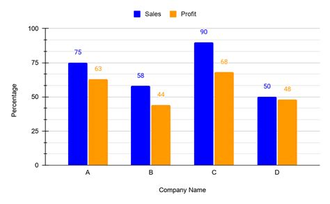
Table of Contents
Bar Graphs and Double Bar Graphs: A Comprehensive Guide
Bar graphs and double bar graphs are fundamental tools in data visualization, offering a clear and concise way to represent categorical data. Understanding their construction, interpretation, and applications is crucial for anyone working with data, from students analyzing classroom performance to professionals interpreting market research. This comprehensive guide will delve into the intricacies of both, equipping you with the knowledge to effectively use and interpret these powerful visual aids.
What is a Bar Graph?
A bar graph, also known as a bar chart, is a visual representation of data using rectangular bars of varying heights or lengths. Each bar represents a specific category, and its height or length corresponds to the value associated with that category. Bar graphs are particularly effective at comparing different categories and highlighting differences in their values. They are versatile and can be used to represent a wide range of data, from sales figures and population demographics to student grades and experimental results.
Key Components of a Bar Graph:
- Horizontal Axis (X-axis): This axis typically represents the categories being compared.
- Vertical Axis (Y-axis): This axis represents the values associated with each category. The scale should be clearly labeled and consistent.
- Bars: Rectangular bars represent each category's value. The height or length of each bar corresponds to the magnitude of the data.
- Labels: Clear and concise labels are essential for understanding the data presented. Labels should identify the categories on the x-axis and the units of measurement on the y-axis.
- Title: A descriptive title summarizing the graph's content is crucial.
Advantages of Using Bar Graphs:
- Easy to Understand: Bar graphs are visually intuitive and easy to interpret, even for those without a strong statistical background.
- Effective Comparison: They facilitate easy comparison of different categories.
- Highlights Trends: They can effectively highlight trends and patterns within the data.
- Versatile: Applicable to a wide range of data types and situations.
- Visually Appealing: When well-designed, bar graphs are aesthetically pleasing and engaging.
Example: Representing Sales Data
Let's say a company wants to visualize its quarterly sales for the year. A bar graph would be ideal. The x-axis would represent the four quarters (Q1, Q2, Q3, Q4), and the y-axis would represent sales revenue in dollars. The height of each bar would correspond to the sales revenue for that particular quarter. This visual representation quickly allows for comparison of sales performance across the four quarters.
What is a Double Bar Graph?
A double bar graph is an extension of a standard bar graph. It displays two sets of data side-by-side for each category, making it particularly useful for comparing two different groups or variables within the same categories. For instance, it can compare sales of two products over several months, or student performance in two subjects across different classes.
Key Differences from a Single Bar Graph:
The primary difference lies in the inclusion of two bars for each category. This allows for a direct comparison between the two datasets within each category. Each set of data is typically represented by a different color or pattern to improve clarity. A key or legend is essential to distinguish between the two datasets.
Creating a Double Bar Graph:
The process of creating a double bar graph is similar to creating a single bar graph. The key steps are:
- Determine the categories: Identify the categories you want to compare (e.g., months, product types, etc.).
- Identify the two datasets: Determine the two sets of data you want to compare for each category.
- Choose appropriate scales: Select scales for both the x-axis (categories) and the y-axis (values) ensuring they are clearly labeled and consistent.
- Draw the bars: Draw two bars side-by-side for each category, representing the values from each dataset. Use different colors or patterns to differentiate the datasets.
- Add labels and a title: Include clear labels for axes, categories, datasets, and a descriptive title. A key or legend explaining the color-coding or pattern is crucial.
Advantages of Using Double Bar Graphs:
- Direct Comparison: Allows for a direct and easy comparison of two datasets within each category.
- Highlights Differences and Similarities: Effectively highlights differences and similarities between the two datasets.
- Improved Data Understanding: Provides a clearer understanding of the relationships between different categories and datasets.
- Enhanced Visual Appeal: The use of color or pattern enhances visual appeal and makes the graph more engaging.
Example: Comparing Sales of Two Products
Consider a company selling two products, A and B, over a period of five months. A double bar graph would effectively compare their monthly sales. Each month would be a category on the x-axis, and the y-axis would represent sales revenue. Two bars for each month would represent the sales of products A and B, differentiated by color (e.g., blue for A, red for B). This visual representation clearly highlights the sales performance of both products over time and allows for quick comparisons across months.
Choosing Between Bar Graphs and Double Bar Graphs:
The choice between a single bar graph and a double bar graph depends entirely on the type and amount of data you need to represent. A single bar graph is sufficient when you're comparing a single variable across different categories. However, when you need to compare two variables within the same categories, a double bar graph becomes more appropriate.
Interpreting Bar Graphs and Double Bar Graphs:
Once you have created a bar graph or double bar graph, you need to be able to interpret the data effectively. This involves:
- Identifying the highest and lowest values: This helps determine which categories perform best or worst.
- Comparing values across categories: This reveals patterns and trends in the data.
- Identifying significant differences: This helps make meaningful conclusions from the data.
- Considering the scale and units: The scale of the axes greatly influences the visual representation; ensure the scale is appropriate and clearly labeled.
- Looking for trends and patterns: Look for any recurring patterns or trends that emerge from the data.
Common Mistakes to Avoid:
- Unclear Labeling: Ensure all axes, bars, and the graph itself are clearly and accurately labeled.
- Inconsistent Scaling: Maintain consistent scaling on both axes. An inconsistent scale can misrepresent the data.
- Overly Crowded Graph: Avoid overcrowding the graph with too much information. Consider splitting the data into multiple graphs if necessary.
- Poor Choice of Colors/Patterns: Select colors and patterns that are easily distinguishable and do not cause confusion.
- Lack of a Title: Always include a descriptive title to summarize the graph's content.
Applications of Bar Graphs and Double Bar Graphs:
Bar graphs and double bar graphs find applications across a wide range of fields:
- Business: Analyzing sales data, market share, customer preferences, and more.
- Education: Comparing student performance, analyzing test scores, and tracking attendance.
- Science: Representing experimental results, comparing different treatment groups, and visualizing data from surveys.
- Government: Tracking economic indicators, demographic data, and social trends.
- Healthcare: Visualizing patient data, analyzing disease prevalence, and comparing treatment outcomes.
Conclusion:
Bar graphs and double bar graphs are essential data visualization tools that provide clear and concise representations of categorical data. Understanding their construction, interpretation, and applications is crucial for effective data analysis and communication. By following the guidelines outlined in this comprehensive guide, you can effectively use these tools to present and interpret your data, leading to better insights and more informed decision-making. Remember to always prioritize clarity, accuracy, and effective communication when designing and interpreting these graphs.
Latest Posts
Latest Posts
-
How Do You Beat Stage 9 On Bloxorz
Jul 06, 2025
-
What Is 1 2 Equivalent To In Fractions
Jul 06, 2025
-
How Do You Say Pork In Spanish
Jul 06, 2025
Related Post
Thank you for visiting our website which covers about Bar Graph And Double Bar Graph . We hope the information provided has been useful to you. Feel free to contact us if you have any questions or need further assistance. See you next time and don't miss to bookmark.