Cluster Analysis Combined With A Box And Whisker Plot
Kalali
Mar 25, 2025 · 6 min read
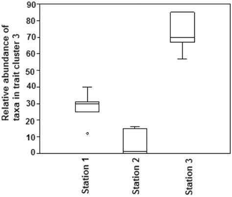
Table of Contents
Cluster Analysis Combined with a Box and Whisker Plot: A Powerful Data Visualization Technique
Cluster analysis and box and whisker plots are two powerful data analysis techniques that, when combined, offer a compelling way to visualize and understand complex datasets. This article delves deep into the synergy between these methods, explaining their individual strengths, demonstrating their combined power, and exploring practical applications across various fields.
Understanding Cluster Analysis
Cluster analysis, also known as clustering, is an unsupervised machine learning technique used to group similar data points together. The goal is to partition a dataset into clusters, where data points within a cluster are more similar to each other than to data points in other clusters. This similarity is determined based on various distance metrics, such as Euclidean distance, Manhattan distance, or cosine similarity, depending on the nature of the data.
Types of Clustering Algorithms
Several algorithms are used for cluster analysis, each with its strengths and weaknesses:
-
K-means clustering: A popular algorithm that partitions data into k clusters, where k is predefined. It iteratively assigns data points to the closest centroid (mean) and updates the centroids until convergence. Its simplicity and efficiency make it widely used, but it's sensitive to the initial centroid positions and assumes spherical clusters.
-
Hierarchical clustering: Builds a hierarchy of clusters, either agglomerative (bottom-up) or divisive (top-down). Agglomerative clustering starts with each data point as a separate cluster and iteratively merges the closest clusters. Divisive clustering starts with all data points in one cluster and recursively splits it. Hierarchical clustering provides a visual representation of the clustering process as a dendrogram, but it can be computationally expensive for large datasets.
-
DBSCAN (Density-Based Spatial Clustering of Applications with Noise): A density-based algorithm that identifies clusters as dense regions separated by sparser regions. It's robust to outliers and can identify clusters of arbitrary shapes, unlike k-means. However, it requires careful parameter tuning (epsilon and minimum points).
-
Gaussian Mixture Models (GMM): Assumes that data points are generated from a mixture of Gaussian distributions, each representing a cluster. GMM provides a probabilistic framework for clustering and can handle clusters of different shapes and sizes. However, it can be computationally intensive and sensitive to initialization.
The Power of Box and Whisker Plots
Box and whisker plots (also known as box plots) are a concise way to visually represent the distribution of a dataset. They display key descriptive statistics, including:
- Median: The middle value of the dataset.
- Quartiles: The values that divide the dataset into four equal parts (25th, 50th, and 75th percentiles).
- Interquartile Range (IQR): The difference between the 75th and 25th percentiles, representing the spread of the central 50% of the data.
- Whiskers: Lines extending from the box, typically reaching to the minimum and maximum values within 1.5 times the IQR from the quartiles. Values beyond this range are considered outliers and are often plotted individually.
Box plots are excellent for comparing distributions across different groups or categories, making them ideal for visualizing the results of cluster analysis.
Combining Cluster Analysis and Box and Whisker Plots
The real power emerges when we combine cluster analysis and box and whisker plots. After applying a clustering algorithm, we can create a box plot for each cluster to visualize the distribution of a specific variable within each cluster. This allows for:
-
Visualizing Cluster Characteristics: By comparing the box plots of different clusters, we can easily identify key differences in the distribution of variables across the clusters. For example, we might see that one cluster has a significantly higher median value for a particular variable than another cluster.
-
Identifying Outliers within Clusters: Box plots highlight outliers within each cluster, which might indicate data errors or unique characteristics within the cluster.
-
Assessing Cluster Validity: Comparing the distributions within clusters can help assess the quality of the clustering. If the distributions within clusters are very different and well-separated, it suggests a good clustering solution. Conversely, overlapping distributions might indicate that the clusters are not well-defined.
Example: Customer Segmentation
Imagine a company wants to segment its customers based on their spending habits and age. They can use cluster analysis (e.g., k-means) to group customers into different segments. After clustering, they can create box plots for each cluster, showing the distribution of spending amounts and age within each segment.
This visualization might reveal:
- Cluster 1 (High Spenders, Older Customers): A box plot showing a high median spending amount and a higher median age.
- Cluster 2 (Low Spenders, Younger Customers): A box plot showing a low median spending amount and a lower median age.
- Cluster 3 (Moderate Spenders, Mixed Age): A box plot showing a moderate median spending amount and a wider range of ages.
This visual representation provides actionable insights for targeted marketing campaigns. The company can tailor its strategies to each segment, offering different promotions or services to appeal to their specific characteristics.
Example: Gene Expression Analysis
In bioinformatics, cluster analysis is often used to group genes based on their expression levels across different samples. Box plots can then be used to compare the expression levels of genes within each cluster across various conditions (e.g., disease vs. healthy). This visual comparison helps identify genes with significantly different expression patterns in different conditions, potentially leading to the discovery of disease biomarkers.
Practical Implementation Steps
-
Data Preparation: Clean and preprocess your data. Handle missing values and outliers appropriately. Consider scaling or normalizing your data if necessary, especially if using distance-based clustering algorithms.
-
Cluster Analysis: Choose an appropriate clustering algorithm based on your data characteristics and the size of your dataset. Experiment with different algorithms and parameter settings to find the best solution. Techniques like silhouette analysis or the elbow method can help determine the optimal number of clusters for k-means.
-
Cluster Visualization: Once you have identified the clusters, create box plots for each cluster for each variable of interest. This allows for direct visual comparison of the distributions within each cluster.
-
Interpretation and Insights: Carefully examine the box plots to identify key differences between clusters, outliers within clusters, and assess the validity of the clustering. Draw conclusions based on the visualized data and relate them back to the context of your analysis.
-
Reporting: Clearly communicate your findings using both the cluster analysis results and the box plots. Explain the chosen algorithm, the interpretation of the clusters, and the insights gleaned from the box plot visualizations.
Advanced Techniques and Considerations
-
Multivariate Box Plots: For datasets with multiple variables, multivariate box plots can provide a more comprehensive visualization of cluster characteristics.
-
Interactive Visualizations: Interactive visualizations, such as those created using tools like Tableau or Plotly, can enhance the exploration and interpretation of cluster analysis results and box plots. Users can dynamically explore different variables and clusters.
-
Statistical Tests: Use statistical tests (e.g., ANOVA, t-tests) to formally compare the distributions of variables across different clusters. This provides statistical significance to the visual observations from the box plots.
-
Dimensionality Reduction: If dealing with high-dimensional data, consider dimensionality reduction techniques (e.g., PCA) before applying cluster analysis to reduce the complexity and improve visualization.
Conclusion
The combination of cluster analysis and box and whisker plots is a powerful approach to data exploration and visualization. It allows for a deep understanding of complex datasets by grouping similar data points and visualizing the distribution of variables within those groups. This technique offers significant advantages in various fields, from customer segmentation and market research to gene expression analysis and scientific discovery. By following the steps outlined and considering the advanced techniques discussed, researchers and analysts can effectively leverage this combined approach to uncover valuable insights and make data-driven decisions.
Latest Posts
Latest Posts
-
R C Cola And A Moon Pie
Jul 04, 2025
-
If I Was 18 What Year Would I Be Born
Jul 04, 2025
-
One And Three Hundred Twenty Four Thousandths
Jul 04, 2025
-
How Much Is 2 Pounds Of Cream Cheese
Jul 04, 2025
-
How Do You Pronounce M I C H A L
Jul 04, 2025
Related Post
Thank you for visiting our website which covers about Cluster Analysis Combined With A Box And Whisker Plot . We hope the information provided has been useful to you. Feel free to contact us if you have any questions or need further assistance. See you next time and don't miss to bookmark.