How To Find The Mean On A Line Plot
Kalali
Apr 01, 2025 · 5 min read
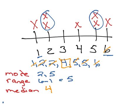
Table of Contents
How to Find the Mean on a Line Plot: A Comprehensive Guide
Line plots, also known as line graphs, are powerful visual tools used to display data over time or across different categories. While they excel at showing trends and patterns, calculating the mean (average) directly from a line plot isn't as straightforward as from a data table. This guide provides a comprehensive walkthrough of how to determine the mean from a line plot, covering various scenarios and providing helpful tips along the way. We'll explore different approaches, considering the nuances involved and ensuring you understand the process completely.
Understanding Line Plots and the Mean
Before diving into the calculations, let's clarify what we're working with.
- Line Plot: A line plot displays data points connected by lines, showing changes over a continuous variable (often time) or discrete categories. Each point represents a data value.
- Mean (Average): The mean is the sum of all data values divided by the total number of data values. It represents the central tendency of the dataset.
The challenge in calculating the mean from a line plot lies in the fact that the raw data values aren't explicitly listed; they're visually represented. Therefore, we need to extract this information before calculating the mean.
Method 1: Extracting Data Points Directly from the Plot
This is the most straightforward method, but it relies on the clarity and precision of the line plot.
Step 1: Identify Data Points: Carefully examine the line plot. Each point represents a data value. Note the value on both the x-axis (usually representing the category or time) and the y-axis (representing the data value).
Step 2: Record Data Values: Create a table to record the x and y values of each data point. The x-axis value provides context, while the y-axis value is the actual data point we'll use for the mean calculation.
Step 3: Calculate the Sum: Add up all the y-axis values (data values) recorded in your table.
Step 4: Calculate the Mean: Divide the sum of the y-axis values by the total number of data points. This result is your mean.
Example:
Let's say a line plot shows monthly sales over six months. The data points are approximately:
- January: 150
- February: 180
- March: 200
- April: 190
- May: 220
- June: 250
Table:
| Month | Sales |
|---|---|
| January | 150 |
| February | 180 |
| March | 200 |
| April | 190 |
| May | 220 |
| June | 250 |
Calculation: (150 + 180 + 200 + 190 + 220 + 250) / 6 = 198.33
Therefore, the mean monthly sales is approximately 198.33.
Method 2: Using Estimation When Data Points are Unclear
Sometimes, a line plot may not provide precise data point values. In such cases, estimation becomes necessary. This introduces a margin of error, but it still provides a reasonable approximation.
Step 1: Estimate Data Points: Visually inspect the line plot and estimate the y-axis value for each point. Try to be as accurate as possible.
Step 2: Record Estimated Values: Create a table and record your estimated y-axis values.
Step 3: Calculate the Sum: Add up all the estimated y-axis values.
Step 4: Calculate the Estimated Mean: Divide the sum of the estimated values by the number of data points.
Important Consideration: Always acknowledge the limitations of estimation. Clearly state that the mean is an approximation and indicate the potential range of error. Using a statement like "The estimated mean is approximately X, with a potential error margin of +/- Y" adds transparency and credibility.
Method 3: Using Software or Spreadsheet Programs
For more complex line plots with numerous data points, using software or spreadsheet programs is highly recommended. These tools offer several advantages:
- Data Import: Many programs can directly import data from various file formats, eliminating manual data entry.
- Automated Calculations: The software automatically calculates the mean once the data is inputted.
- Data Visualization: The programs provide various visualization options, enhancing data analysis.
- Accuracy: Reduces the risk of human error in data entry and calculation.
Popular choices include:
- Microsoft Excel: A widely used spreadsheet program with built-in functions for statistical analysis.
- Google Sheets: A cloud-based spreadsheet program offering similar functionality to Excel.
- Statistical Software Packages (R, SPSS, etc.): Advanced statistical software packages provide powerful tools for data analysis, including calculating means and creating sophisticated visualizations.
Dealing with Different Line Plot Types
The process of calculating the mean can vary slightly depending on the type of line plot:
- Simple Line Plots: These plots typically show a single data series over time or categories. The methods described above are directly applicable.
- Multiple Line Plots: If a plot shows multiple data series, you'll need to calculate the mean separately for each series. Clearly label your calculations to avoid confusion.
- Line Plots with Irregular Intervals: If the intervals between data points are inconsistent (e.g., uneven time intervals), the mean calculation remains the same, but you need to ensure that you accurately represent the data points in your calculations.
Avoiding Common Mistakes
- Incorrect Data Point Identification: Double-check your readings from the plot to ensure accuracy. Errors in this step will propagate throughout the calculation.
- Ignoring Units: Always include the units of measurement in your final answer (e.g., dollars, kilograms, etc.).
- Misinterpreting the Plot: Understand the axes and what the plot is conveying before attempting calculations.
Beyond the Mean: Other Statistical Measures
While the mean is a useful measure of central tendency, it's not always the best indicator of the data's characteristics. Consider exploring other statistical measures like:
- Median: The middle value when data is ordered. Less sensitive to outliers than the mean.
- Mode: The most frequent value. Useful for identifying common occurrences.
- Standard Deviation: A measure of the spread or dispersion of the data around the mean.
Conclusion: Mastering Mean Calculation from Line Plots
Calculating the mean from a line plot requires careful observation, accurate data extraction (or estimation), and meticulous calculation. While seemingly straightforward, understanding the nuances of different plot types and potential sources of error is crucial for obtaining accurate and meaningful results. Utilizing spreadsheet programs or statistical software for complex plots can significantly improve efficiency and accuracy, ensuring reliable analysis of your data. Remember always to clearly present your findings, acknowledging any estimations or limitations in your approach. By mastering these techniques, you'll be well-equipped to extract valuable insights from line plots and use them effectively for data-driven decision-making.
Latest Posts
Latest Posts
-
In Many States Trailers With A Gvwr Of 1500
Jul 10, 2025
-
How Many Tablespoons Are In A Hidden Valley Ranch Packet
Jul 10, 2025
-
Which Is The Best Summary Of The Passage
Jul 10, 2025
-
How Many Quarts Of Soil In A Cubic Foot
Jul 10, 2025
-
What Is 3 4 Of A Pound
Jul 10, 2025
Related Post
Thank you for visiting our website which covers about How To Find The Mean On A Line Plot . We hope the information provided has been useful to you. Feel free to contact us if you have any questions or need further assistance. See you next time and don't miss to bookmark.