How To Label A Box Plot
Kalali
Mar 31, 2025 · 7 min read
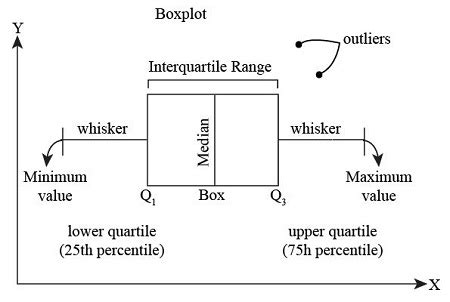
Table of Contents
How to Label a Box Plot: A Comprehensive Guide
Box plots, also known as box-and-whisker plots, are powerful visual tools for summarizing and comparing distributions of numerical data. They effectively display key statistical features such as median, quartiles, and potential outliers. However, the true power of a box plot is unlocked when it’s clearly and effectively labeled. A well-labeled box plot tells a story, making the data easily understandable and interpretable. This comprehensive guide will walk you through everything you need to know about labeling a box plot effectively, enhancing its clarity and conveying the information accurately.
Understanding the Components of a Box Plot
Before diving into labeling, it’s crucial to understand the components a box plot represents. This knowledge forms the foundation for creating effective and informative labels.
1. The Box: Representing the Interquartile Range (IQR)
The central rectangle, or box, represents the interquartile range (IQR). The IQR is the difference between the third quartile (Q3) – the 75th percentile – and the first quartile (Q1) – the 25th percentile. The box visually encapsulates the middle 50% of your data.
2. The Median: The Middle Value
A line inside the box signifies the median (Q2), the middle value of your dataset. If the median is closer to Q1, it suggests a left-skewed distribution; conversely, proximity to Q3 indicates a right-skewed distribution. A centrally located median suggests a relatively symmetric distribution.
3. The Whiskers: Extremes of the Data
The lines extending from the box, known as whiskers, represent the range of your data, excluding potential outliers. Commonly, the whiskers extend to the minimum and maximum values within 1.5 times the IQR from the quartiles (Q1 and Q3). Data points beyond this range are often considered outliers.
4. Outliers: Points Outside the Whiskers
Outliers are data points that fall significantly outside the range defined by the whiskers. They are usually plotted individually as points beyond the whiskers, highlighting potential anomalies or exceptional values in your dataset.
Essential Elements of Effective Box Plot Labeling
Creating a clear and informative box plot goes beyond just displaying the data; it involves thoughtful labeling to ensure your audience easily grasps the information presented. Here are the crucial elements of effective labeling:
1. Clear and Concise Title: Setting the Context
Your box plot needs a title that accurately reflects the data presented. The title should be concise, informative, and immediately convey the subject matter. For instance, instead of a vague title like "Box Plot," use something specific like "Distribution of Student Exam Scores by Grade Level" or "Comparison of Sales Figures Across Different Marketing Campaigns." A strong title instantly contextualizes the plot for your audience.
Example: Instead of: Box Plot of Sales use: Quarterly Sales Performance: 2023
2. Axis Labels: Defining the Variables
Clearly labeling your axes is paramount. The horizontal axis (x-axis) typically represents the categorical variable (e.g., different groups, treatments, time periods), while the vertical axis (y-axis) represents the numerical variable (e.g., measurements, scores, values). Use descriptive labels that precisely identify what each axis represents. Avoid abbreviations unless they are widely understood within the context.
Example: If the x-axis represents different types of cars and the y-axis represents fuel efficiency, label the x-axis "Car Model" and the y-axis "Miles Per Gallon (MPG)."
3. Group Labels: Distinguishing Categories
If your box plot compares multiple groups, ensure each group is clearly identified. This can be done by:
- Adding labels directly to the boxes: This is often the simplest approach, especially if you have only a few groups.
- Using a legend: For more complex plots with many groups, a legend provides a clearer visual representation of which box corresponds to which category.
- Using labels on the x-axis: If the x-axis represents the categorical variable, labeling the x-axis ticks with group names is a straightforward and effective method.
Example: In a box plot comparing the heights of men and women, clearly label each box as "Men" and "Women," either directly on the boxes or using a legend.
4. Numerical Labels: Indicating Key Values
Consider adding numerical labels to highlight specific statistical values within the plot. This can include:
- Median Value: Display the median value for each group directly on the plot. This helps quickly identify the central tendency of each distribution.
- Quartiles (Q1 and Q3): While not always necessary, including Q1 and Q3 values can provide a more comprehensive understanding of the data's spread.
- Outlier Values: If outliers are present, label them individually with their corresponding values. This helps to draw attention to these significant data points and further investigation may be needed.
Example: Alongside the box representing "Men's Height," you could display the median (e.g., "Median: 175 cm"), Q1, and Q3 values.
5. Units of Measurement: Ensuring Clarity
Always specify the units of measurement for the numerical variable. This ensures your audience understands the scale of the data being presented. For instance, if your y-axis represents income, specify whether the units are in dollars, euros, or another currency.
Example: Instead of just labeling the y-axis "Income," label it "Annual Income (USD)."
6. Data Source and Date: Providing Context and Transparency
If applicable, indicate the source of your data and the date the data was collected. This enhances the transparency and credibility of your visual representation. This is particularly relevant when presenting research findings or analytical reports.
Example: Include a note like "Data Source: Company Sales Database, Q3 2024" at the bottom of your box plot.
Advanced Labeling Techniques for Enhanced Clarity
For more complex scenarios, consider using these advanced techniques to enhance the clarity and readability of your box plot:
1. Color-Coding: Enhancing Visual Distinctions
Use different colors to distinguish groups within your box plot. Choose colors that are visually distinct and easy to interpret. Avoid using too many colors, as this can make the plot cluttered and difficult to understand. A color legend is crucial if you're using color coding.
2. Adding Notations: Highlighting Key Findings
If you want to highlight specific observations or insights, you can add text notations directly onto the plot. Use concise and clear language to avoid cluttering the visualization.
3. Utilizing Different Plot Styles: Tailoring to the Data
Experiment with different box plot styles. Some plotting libraries offer variations such as notched box plots which can highlight potential differences in medians, or variations showing the mean instead of or in addition to the median. Choose a style that best suits the nature of your data and enhances the visual appeal and clarity.
Software and Tools for Creating and Labeling Box Plots
Numerous software packages and tools facilitate the creation and labeling of box plots. Popular options include:
- Statistical software: R, Python (with libraries like Matplotlib and Seaborn), SPSS, SAS. These offer extensive customization options for labeling and styling.
- Spreadsheet software: Microsoft Excel, Google Sheets. These provide simpler, built-in functions for generating basic box plots, though customization may be limited.
- Data visualization tools: Tableau, Power BI. These tools excel at creating interactive and visually appealing box plots with advanced labeling capabilities.
Remember to consult the specific documentation for the software or tool you use to understand how to effectively apply the labeling techniques discussed above.
Conclusion: Communicating Effectively with Data Visualization
A well-labeled box plot is not merely a visual representation of data; it's a powerful communication tool. By adhering to the guidelines and techniques outlined in this guide, you can create compelling box plots that effectively convey your data's key characteristics, enhancing understanding and facilitating better decision-making. Remember, clarity, precision, and context are paramount in ensuring your box plots communicate their message successfully. The goal is to make the data accessible and understandable to a broad audience, regardless of their statistical expertise. By combining effective labeling with a strong understanding of your data, you can harness the true power of box plots for insightful communication.
Latest Posts
Latest Posts
-
22 5 Out Of 30 As A Percentage
Apr 01, 2025
-
How Do You Write 2 As A Decimal
Apr 01, 2025
-
How Many Inches Are In 1 1 2
Apr 01, 2025
-
What Percent Of 600 Is 3
Apr 01, 2025
-
How Tall Is 24 Inches In Feet
Apr 01, 2025
Related Post
Thank you for visiting our website which covers about How To Label A Box Plot . We hope the information provided has been useful to you. Feel free to contact us if you have any questions or need further assistance. See you next time and don't miss to bookmark.
