Range In Stem And Leaf Plot
Kalali
Mar 26, 2025 · 8 min read
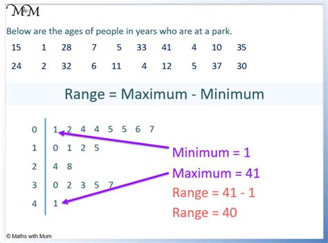
Table of Contents
Understanding Range in Stem and Leaf Plots: A Comprehensive Guide
Stem and leaf plots, also known as stem-and-leaf diagrams, are a valuable tool in descriptive statistics. They provide a simple yet effective way to visualize and summarize numerical data, offering a clear picture of the data's distribution. While seemingly straightforward, understanding the nuances of interpreting data within a stem and leaf plot, particularly the concept of range, is crucial for accurate data analysis. This comprehensive guide will delve into the intricacies of range within the context of stem and leaf plots, providing practical examples and explanations to enhance your understanding.
What is a Stem and Leaf Plot?
Before we dive into the range, let's establish a firm understanding of stem and leaf plots themselves. A stem and leaf plot is a visual representation of data that separates each data point into two parts: the stem and the leaf. The stem represents the leading digit(s) of the data, while the leaf represents the trailing digit(s). This arrangement allows for a quick and easy visualization of the data's distribution, including the frequency of different values and the presence of outliers.
Example: Consider the following dataset representing the scores of 15 students on a math test: 78, 85, 92, 75, 88, 95, 72, 80, 90, 82, 79, 86, 93, 89, 77.
A stem and leaf plot for this data would look like this:
| Stem | Leaf |
|---|---|
| 7 | 2, 5, 7, 8, 9 |
| 8 | 0, 2, 5, 6, 8, 9 |
| 9 | 0, 2, 3, 5 |
Here, the stems (7, 8, 9) represent the tens digits, and the leaves represent the units digits. This neatly organizes the data, making it easy to see the frequency of scores in each tens range.
Defining Range in a Statistical Context
The range in statistics is a simple measure of dispersion, representing the difference between the highest and lowest values in a dataset. It provides a basic understanding of the spread or variability of the data. A larger range indicates greater variability, while a smaller range suggests less variability. The range is easily calculated by subtracting the minimum value from the maximum value.
Formula: Range = Maximum Value – Minimum Value
Calculating the Range from a Stem and Leaf Plot
Determining the range from a stem and leaf plot is straightforward. Simply identify the smallest value (minimum) and the largest value (maximum) from the plot. The difference between these two values gives you the range.
Example (Continuing from the previous example):
Looking at our stem and leaf plot, the minimum value is 72 (stem 7, leaf 2), and the maximum value is 95 (stem 9, leaf 5).
Therefore, the range is: 95 – 72 = 23.
This tells us that the scores on the math test spanned a range of 23 points.
Importance of Range in Data Analysis
The range, while a simple measure, plays a crucial role in data analysis. It:
- Provides a quick overview of data spread: It gives an immediate sense of how spread out the data is.
- Helps identify potential outliers: An unusually large range might suggest the presence of outliers—values significantly different from the rest of the data. Further investigation is needed to confirm if these are true outliers or data entry errors.
- Informs the choice of other statistical measures: The range can influence the selection of other descriptive statistics. For instance, a large range might necessitate the use of measures of central tendency that are less sensitive to outliers, like the median instead of the mean.
- Facilitates comparison across datasets: Comparing the ranges of different datasets allows for a comparative analysis of their variability.
Limitations of Range as a Measure of Dispersion
While the range is easy to calculate and interpret, it has limitations:
- Sensitivity to outliers: The range is heavily influenced by outliers. A single extremely high or low value can significantly inflate the range, giving a misleading representation of the data's typical spread.
- Ignores data distribution: The range only considers the extreme values and doesn't provide information about the distribution of data points between these extremes. A dataset with the same range can have very different distributions.
- Not suitable for all data types: The range is most suitable for numerical data. Its application to categorical or ordinal data is limited.
Using Range with Other Descriptive Statistics
To overcome the limitations of the range, it's often beneficial to use it in conjunction with other descriptive statistics, such as:
- Mean: The average of all values in the dataset.
- Median: The middle value when the data is arranged in ascending order.
- Mode: The value that appears most frequently in the dataset.
- Standard Deviation: A measure of the average distance of data points from the mean. It provides a more robust measure of dispersion compared to the range.
- Interquartile Range (IQR): The difference between the third quartile (75th percentile) and the first quartile (25th percentile). It's less susceptible to outliers than the range.
By combining the range with these other measures, you gain a more comprehensive understanding of the data's central tendency, variability, and distribution.
Advanced Applications and Interpretations of Range in Stem and Leaf Plots
Let's explore some more nuanced applications and interpretations of the range within the context of stem and leaf plots:
1. Identifying Data Clusters and Gaps: While calculating the range gives you the overall spread, examining the stem and leaf plot itself reveals potential clusters of data points (areas with high frequency) and gaps (areas with no data points). These observations can be valuable in identifying patterns and potential underlying factors influencing the data.
2. Comparing Ranges Across Multiple Datasets: Stem and leaf plots are particularly useful for comparing the ranges of multiple datasets side-by-side. By constructing separate plots for each dataset, you can visually compare their overall spreads and identify significant differences or similarities in their variability.
3. Detecting Outliers: As mentioned earlier, a significantly large range can be an indicator of potential outliers. While the range alone doesn't definitively identify outliers, it prompts further investigation using box plots or other outlier detection methods. Visual inspection of the stem and leaf plot can help pinpoint the suspected outliers.
4. Range in relation to other statistical measures: Understanding the range in the context of other statistical measures such as the mean, median, and standard deviation provides a more complete picture of the data's distribution. For example, a large range coupled with a small standard deviation might suggest the presence of a few extreme values pulling the range upwards.
5. Subgroup Analysis: Stem and leaf plots can be used to analyze subgroups within a larger dataset. For instance, if you have data on student test scores categorized by gender, you can create separate stem and leaf plots for male and female students and then compare their respective ranges. This allows for a detailed comparison of the variability of test scores between the two subgroups.
Practical Examples Illustrating Range Interpretation
Let's examine a few scenarios that highlight the importance of understanding the range within a stem and leaf plot:
Scenario 1: Comparing Test Scores
Two classes took the same exam. Their scores are represented in two stem and leaf plots:
Class A:
| Stem | Leaf |
|---|---|
| 7 | 0, 2, 5, 8 |
| 8 | 1, 3, 5, 6, 8 |
| 9 | 0, 2, 5 |
Class B:
| Stem | Leaf |
|---|---|
| 6 | 5, 8 |
| 7 | 2, 4, 6, 9 |
| 8 | 0, 2, 5, 7 |
| 9 | 3 |
Analysis: Class A has a range of 25 (95-70) while Class B has a range of 28 (93-65). While the ranges are relatively close, the stem-and-leaf plot shows Class B's scores are more spread out. A further analysis using standard deviation or IQR would provide a more precise comparison of the spread.
Scenario 2: Identifying Potential Outliers
A dataset of daily rainfall in millimeters is represented in a stem and leaf plot:
| Stem | Leaf |
|---|---|
| 0 | 5, 8, 9 |
| 1 | 0, 2, 5, 7 |
| 2 | 0, 3 |
| 3 | 5 |
| 4 | 2 |
| 5 | |
| 6 | 0 |
Analysis: The range is 60 - 0.5 = 59.5mm. The value of 60mm appears to be an outlier because of the large gap and the relatively small values of the rest of the dataset. Further investigation is needed to determine if this is a valid data point or an error.
Conclusion
Understanding the range within the context of stem and leaf plots is essential for effective data analysis. While a simple measure, it provides a valuable initial insight into the spread of the data, potentially highlighting outliers and informing the choice of other statistical measures. However, it's crucial to remember the limitations of the range and to interpret it in conjunction with other descriptive statistics for a comprehensive understanding of the data's distribution and variability. By mastering the interpretation of range in stem and leaf plots, you significantly enhance your data analysis capabilities and gain valuable insights from your datasets.
Latest Posts
Latest Posts
-
How Many Grams Is A 8th Of An Ounce
Mar 29, 2025
-
How Many Feet Is 66 5 Inches
Mar 29, 2025
-
1 2 Pint Is How Many Cups
Mar 29, 2025
-
A Wave Bouncing Off Of An Object Is Called
Mar 29, 2025
-
How Many Feet Is 158 Cm
Mar 29, 2025
Related Post
Thank you for visiting our website which covers about Range In Stem And Leaf Plot . We hope the information provided has been useful to you. Feel free to contact us if you have any questions or need further assistance. See you next time and don't miss to bookmark.
