Scatter Plots And Lines Of Best Fit
Kalali
Mar 14, 2025 · 7 min read
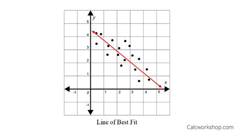
Table of Contents
Scatter Plots and Lines of Best Fit: A Comprehensive Guide
Scatter plots are a fundamental tool in statistics used to visually represent the relationship between two variables. They're incredibly versatile, offering insights into correlations, trends, and potential causal links between data points. Understanding how to create, interpret, and analyze scatter plots, including calculating and interpreting lines of best fit, is crucial for anyone working with data analysis. This comprehensive guide will delve into the intricacies of scatter plots and lines of best fit, providing a clear and practical understanding of this essential statistical tool.
Understanding Scatter Plots
A scatter plot is a type of graph that displays data as a collection of points, each having the value of one variable determining the position on the horizontal axis and the value of the other variable determining the position on the vertical axis. The resulting visual representation allows us to quickly identify patterns, trends, and correlations between the two variables.
Key Components of a Scatter Plot:
- X-axis (Horizontal): Represents the independent variable (often denoted as 'x'). This is the variable that is believed to influence or predict the other variable.
- Y-axis (Vertical): Represents the dependent variable (often denoted as 'y'). This is the variable that is believed to be influenced or predicted by the independent variable.
- Data Points: Each point on the scatter plot represents a pair of values (x, y) from the dataset. The position of each point reflects the values of the corresponding variables.
Types of Correlations:
The relationship between the two variables in a scatter plot can be categorized into several types:
- Positive Correlation: As the independent variable (x) increases, the dependent variable (y) also increases. The points generally trend upwards from left to right.
- Negative Correlation: As the independent variable (x) increases, the dependent variable (y) decreases. The points generally trend downwards from left to right.
- No Correlation: There's no discernible relationship between the two variables. The points appear randomly scattered without any clear trend.
- Nonlinear Correlation: The relationship between the variables isn't linear; it might follow a curve or other non-straight-line pattern.
Creating Scatter Plots
Scatter plots can be easily created using various software packages, including spreadsheet programs like Microsoft Excel or Google Sheets, statistical software like R or SPSS, and even online graphing tools. The process generally involves:
-
Data Input: Enter your data into a spreadsheet or data input area. Ensure you have two columns, one for the independent variable (x) and one for the dependent variable (y).
-
Chart Selection: Choose the "Scatter Plot" or "XY Scatter" option from the charting tools.
-
Axis Labeling: Label the x-axis and y-axis clearly with the variable names and units.
-
Title: Add a descriptive title to the scatter plot.
-
Customization (Optional): Adjust the appearance of the plot by changing colors, adding a legend, or modifying axis ranges as needed for optimal clarity and visual appeal.
Lines of Best Fit (Regression Lines)
A line of best fit, also known as a regression line, is a straight line that best represents the trend shown by the data points in a scatter plot. It helps visualize the relationship between the variables and provides a way to predict the value of the dependent variable based on the value of the independent variable. The most common method for finding the line of best fit is the method of least squares.
The Method of Least Squares
The method of least squares aims to minimize the sum of the squared vertical distances between each data point and the regression line. This means the line is positioned to be as close as possible to all the data points, minimizing the overall error. The equation of a line of best fit is typically expressed in the form:
y = mx + c
Where:
- y is the dependent variable
- x is the independent variable
- m is the slope of the line (representing the rate of change of y with respect to x)
- c is the y-intercept (the value of y when x is 0)
Calculating 'm' and 'c' manually can be tedious, especially with large datasets. Fortunately, spreadsheet software and statistical packages readily calculate these values using built-in functions (like LINEST in Excel or lm() in R).
Interpreting the Line of Best Fit
Once you've determined the line of best fit, its slope and intercept provide valuable insights:
-
Slope (m): Indicates the direction and strength of the relationship between the variables. A positive slope signifies a positive correlation, while a negative slope indicates a negative correlation. The magnitude of the slope reflects the steepness of the relationship; a steeper slope means a stronger relationship.
-
Y-intercept (c): Represents the predicted value of the dependent variable when the independent variable is zero. However, it's important to consider the context; the y-intercept might not always be meaningful if the independent variable cannot realistically take a value of zero.
-
R-squared (R²): This value, often provided alongside the line of best fit, represents the proportion of variance in the dependent variable that is explained by the independent variable. It ranges from 0 to 1, with higher values indicating a better fit. An R² of 0.8, for example, means that 80% of the variation in the dependent variable can be attributed to the variation in the independent variable.
Limitations of Lines of Best Fit
While lines of best fit are extremely useful, it's crucial to acknowledge their limitations:
-
Correlation does not equal causation: Even a strong correlation doesn't necessarily imply a causal relationship between the variables. Other factors might be influencing the observed relationship.
-
Outliers: Extreme data points (outliers) can significantly affect the position and slope of the line of best fit, potentially distorting the overall representation of the data. Careful consideration should be given to outliers, and their potential influence should be evaluated. Sometimes, it is appropriate to remove outliers, but only after careful consideration and justification.
-
Linearity Assumption: The method of least squares assumes a linear relationship between the variables. If the relationship is non-linear, a straight line won't adequately represent the data, and other methods, such as non-linear regression, may be necessary.
-
Extrapolation: Extending the line of best fit beyond the range of the observed data (extrapolation) can lead to inaccurate predictions. It's essential to stay within the bounds of the data when making predictions based on the regression line.
Applications of Scatter Plots and Lines of Best Fit
Scatter plots and lines of best fit find broad applications across numerous fields, including:
- Economics: Analyzing the relationship between inflation and unemployment, consumer spending and income.
- Finance: Predicting stock prices based on market trends.
- Science: Studying the relationship between temperature and reaction rates in chemical experiments.
- Engineering: Analyzing the relationship between material properties and stress levels.
- Medicine: Investigating the correlation between dosage and treatment effectiveness.
- Environmental Science: Studying the relationship between pollution levels and environmental damage.
The versatility of these tools makes them indispensable for identifying patterns, making predictions, and supporting evidence-based decision-making in a wide range of disciplines.
Advanced Concepts
For more in-depth analysis, several advanced concepts extend the basic understanding of scatter plots and lines of best fit:
-
Multiple Regression: Analyzing the relationship between a dependent variable and multiple independent variables.
-
Polynomial Regression: Fitting a curve (polynomial function) instead of a straight line to data exhibiting non-linear relationships.
-
Weighted Least Squares: Assigning different weights to data points based on their reliability or variance.
-
Robust Regression: Methods that are less sensitive to outliers than ordinary least squares.
Conclusion
Scatter plots and lines of best fit are powerful tools for data visualization and analysis. By understanding how to create, interpret, and critically evaluate these tools, you can gain valuable insights from your data and make more informed decisions. Remember to always consider the limitations of these methods and interpret your results within the appropriate context. Continuous learning and exploration of advanced techniques will further enhance your ability to effectively analyze and interpret data using these fundamental statistical tools. While software simplifies the calculations, a solid understanding of the underlying principles remains crucial for proper interpretation and effective data analysis. Always remember to visually inspect your scatter plots for outliers and non-linear trends before relying solely on the line of best fit for conclusions.
Latest Posts
Latest Posts
-
How To Clean Olive Oil Spill
Mar 14, 2025
-
What Organisms Break Down Chemical Wastes In A Treatment Plant
Mar 14, 2025
-
What Is 4 25 As A Percent
Mar 14, 2025
-
How Many Feet And Inches Are In 150 Inches
Mar 14, 2025
-
How To Make Obsidian In Real Life
Mar 14, 2025
Related Post
Thank you for visiting our website which covers about Scatter Plots And Lines Of Best Fit . We hope the information provided has been useful to you. Feel free to contact us if you have any questions or need further assistance. See you next time and don't miss to bookmark.
