Scatterplot With Line Of Best Fit
Kalali
Mar 14, 2025 · 7 min read
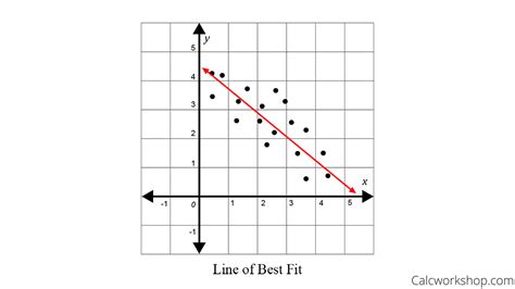
Table of Contents
Scatter Plots with Lines of Best Fit: A Comprehensive Guide
Scatter plots are fundamental tools in data visualization and analysis. They offer a powerful way to explore the relationship between two continuous variables. By plotting individual data points on a Cartesian plane, we can quickly identify trends, clusters, and outliers. Adding a line of best fit enhances this visualization by summarizing the overall relationship between the variables, allowing for predictions and further statistical analysis. This comprehensive guide delves deep into the concept of scatter plots with lines of best fit, exploring their creation, interpretation, and applications.
Understanding Scatter Plots
A scatter plot, also known as a scatter diagram or scatter graph, visually represents the relationship between two variables. Each point on the plot corresponds to a single observation, with its horizontal (x-axis) and vertical (y-axis) coordinates representing the values of the two variables. The overall pattern of the points reveals the nature of the relationship:
- Positive Correlation: As the x-variable increases, the y-variable tends to increase. The points cluster around a line sloping upwards from left to right.
- Negative Correlation: As the x-variable increases, the y-variable tends to decrease. The points cluster around a line sloping downwards from left to right.
- No Correlation: There's no discernible pattern between the variables. The points appear randomly scattered.
Key Elements of a Scatter Plot:
- X-axis (Horizontal): Represents the independent variable (often denoted as 'x').
- Y-axis (Vertical): Represents the dependent variable (often denoted as 'y').
- Data Points: Each point represents a single observation with its corresponding x and y values.
- Labels and Title: Clear labels for axes and a descriptive title are crucial for understanding the plot.
The Line of Best Fit (Regression Line)
The line of best fit, also called the regression line, is a straight line that best represents the overall trend in a scatter plot. It's a mathematical approximation of the relationship between the two variables. The line is positioned to minimize the overall distance between itself and all the data points. This minimization is typically achieved using the method of least squares, which aims to minimize the sum of the squared vertical distances between the data points and the line.
Types of Regression Lines:
While the term "line of best fit" is often used generally, the specific method used to fit the line determines its type:
- Linear Regression: This is the most common type, assuming a linear relationship between the variables. The line is a straight line of the form y = mx + c, where 'm' is the slope and 'c' is the y-intercept.
- Polynomial Regression: Used when the relationship is non-linear, fitting a curve instead of a straight line. This can be quadratic (y = ax² + bx + c), cubic, or of higher order.
- Other Regression Techniques: More sophisticated methods like logistic regression (for binary dependent variables) or multiple regression (for more than two variables) exist for specific situations.
Calculating the Line of Best Fit
The calculation of the line of best fit (specifically, linear regression) involves determining the slope (m) and y-intercept (c) using the following formulas:
-
Slope (m): m = Σ[(xi - x̄)(yi - ȳ)] / Σ[(xi - x̄)²]
Where:
- xi and yi are the individual data points.
- x̄ and ȳ are the means (averages) of the x and y values, respectively.
- Σ denotes summation.
-
Y-intercept (c): c = ȳ - m * x̄
These calculations are often performed using statistical software or programming languages like Python (with libraries such as NumPy and SciPy) or R. Spreadsheet software like Microsoft Excel also offers built-in functions for linear regression analysis.
Interpreting the Slope and Intercept:
- Slope (m): Indicates the rate of change of the dependent variable (y) with respect to the independent variable (x). A positive slope indicates a positive correlation, while a negative slope indicates a negative correlation. The magnitude of the slope indicates the strength of the relationship.
- Y-intercept (c): Represents the predicted value of y when x is 0. It's important to note that the y-intercept might not be meaningful in all contexts, especially if the x-values don't include 0.
Applications of Scatter Plots with Lines of Best Fit
Scatter plots with lines of best fit find widespread applications across numerous fields:
- Business and Economics: Forecasting sales, analyzing market trends, predicting customer behavior, and understanding the relationship between advertising spend and revenue.
- Science and Engineering: Identifying correlations between variables in experiments, modeling physical phenomena, and making predictions based on empirical data.
- Healthcare: Studying the relationship between risk factors and disease prevalence, analyzing patient outcomes, and understanding the effectiveness of treatments.
- Social Sciences: Exploring correlations between social and economic factors, analyzing survey data, and understanding societal trends.
- Environmental Science: Modeling climate change, analyzing pollution levels, and understanding ecological relationships.
Interpreting the Scatter Plot and Line of Best Fit: Beyond the Basics
While the line of best fit provides a summary of the overall trend, it's crucial to also examine the individual data points and their relationship to the line.
Assessing the Strength of the Relationship:
The correlation coefficient (r) provides a numerical measure of the strength and direction of the linear relationship between two variables. It ranges from -1 (perfect negative correlation) to +1 (perfect positive correlation), with 0 indicating no linear correlation. The closer the absolute value of 'r' is to 1, the stronger the linear relationship.
Identifying Outliers:
Outliers are data points that lie significantly far from the overall trend represented by the line of best fit. They can significantly influence the slope and intercept of the line. It's important to investigate outliers to determine if they are due to measurement errors, data entry mistakes, or represent genuinely unusual observations.
Assessing the Goodness of Fit:
The coefficient of determination (R²) measures the proportion of variance in the dependent variable (y) that is explained by the independent variable (x). It ranges from 0 to 1, with higher values indicating a better fit. A high R² suggests that the line of best fit is a good representation of the data, while a low R² suggests a weak fit.
Limitations of Linear Regression:
It's crucial to acknowledge the limitations of using linear regression. It assumes a linear relationship between variables. If the relationship is non-linear, a linear regression line will not accurately represent the data, leading to inaccurate predictions. Furthermore, correlation does not imply causation. Even if a strong correlation exists, it doesn't necessarily mean that one variable causes a change in the other. There might be other confounding variables at play.
Advanced Considerations: Non-Linear Relationships and Multiple Regression
When the relationship between variables isn't linear, more sophisticated techniques are needed. Polynomial regression fits curves to the data, capturing non-linear trends more accurately. For example, a quadratic regression (y = ax² + bx + c) can model U-shaped or inverted U-shaped relationships.
Multiple Regression: When dealing with more than two variables, multiple regression is used. This extends the principles of linear regression to include multiple independent variables, allowing for a more comprehensive analysis of their combined influence on the dependent variable.
Creating Scatter Plots and Lines of Best Fit: Practical Tools
Numerous tools facilitate the creation and analysis of scatter plots with lines of best fit:
- Statistical Software: Packages like SPSS, SAS, R, and Stata offer powerful statistical capabilities, including regression analysis and advanced visualization tools.
- Programming Languages: Python (with libraries like Matplotlib, Seaborn, and Statsmodels) and R provide extensive libraries for data manipulation, visualization, and statistical analysis.
- Spreadsheet Software: Microsoft Excel, Google Sheets, and other spreadsheet programs offer built-in functions for creating scatter plots and performing linear regression. These are user-friendly options for simpler analyses.
Conclusion
Scatter plots with lines of best fit are invaluable tools for exploring and summarizing the relationships between two continuous variables. By understanding how to create, interpret, and apply these techniques, researchers and analysts can gain crucial insights from their data, leading to better decision-making and a deeper understanding of complex phenomena. Remember to always critically assess the data, consider potential outliers and limitations, and choose the appropriate regression technique based on the nature of the relationship between variables. The combination of visual representation and quantitative analysis provided by scatter plots with lines of best fit allows for a robust and insightful approach to data analysis.
Latest Posts
Latest Posts
-
Imagery Or Figurative Language From Romeo And Juliet
Jul 02, 2025
-
What Is A Quarter Of A Million
Jul 02, 2025
-
Which Of The Following Is True Concerning A Dao
Jul 02, 2025
-
How Long Can Catfish Live Out Of Water
Jul 02, 2025
-
Is Kanye West Related To Cornel West
Jul 02, 2025
Related Post
Thank you for visiting our website which covers about Scatterplot With Line Of Best Fit . We hope the information provided has been useful to you. Feel free to contact us if you have any questions or need further assistance. See you next time and don't miss to bookmark.